ICC Alpha is live

17 March 2014

Apologies for the lack of updates here. Exciting news:

ICC Alpha, a prototype which contains ideas and solutions for some of the most important needs of ICC website users, is now ready.

It is by no means complete, but we are releasing ICC Alpha now because we want to hear your comments about the approach that we are taking.

If you are interested in reviewing ICC Alpha and providing feedback, please get in touch (link no longer working) and we will send you the details.

Your comments and thoughts will help us to improve the new website.

ICC Alpha — Competitor review

11 October 2013

We’ve looked at lots of other websites in the field of international justice and a few beyond to find interesting and exciting stuff. Suggestions have come from the website survey, interviews, conversations and a blog post.

Here are some of the things we’ve found. These ideas and approaches will inform the design stage of the ICC Alpha.  You can download a pdf version (5.6MB) from Scribd if you prefer.

IA / Top Navigation

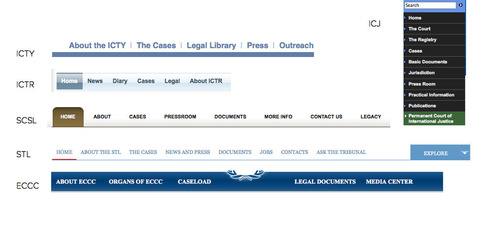
Top navigation of judicial websites

Lots of similar judicial sites follow the same IA format. Instead consider splitting the user journey more starkly with structured browse – situations/cases and the court – and having more flexible navigation. eg breadcrumb for situations/cases and a big footer. Use relatedness / relationships (tagging and metadata).

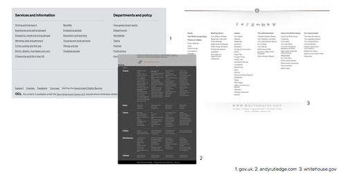
Big footers

Big footers examples

Good for reference. Informative. Useful. Almost like a sitemap at the bottom of every page.

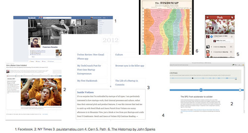
Timelines

Timeline examples

An important tool to provide clarity, context and depth for the complex cases the ICC deals with, eg telling the story of the case.

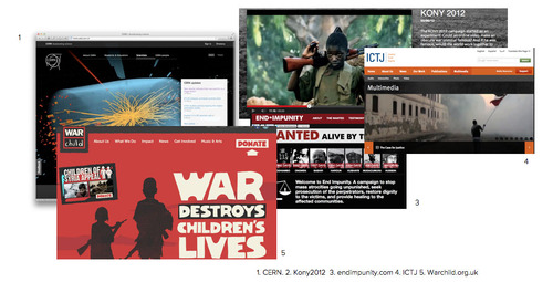
Imagery / Video

Imagery examples

Not just walls of text. Telling a human story. Educate and inspire. Show what’s happening inside the ICC and beyond. Look further than the default option (robed judges in court).

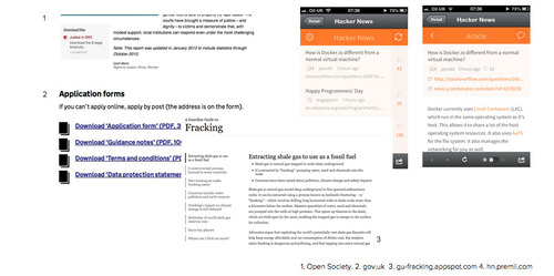
Presenting lots of text / pdfs

Examples of how websites present lots of text

HTML needs to be the default publishing format with the exception of court filings. Effective use of typography. Plenty of white space. Readability on all devices is paramount. Clear indication of download, format, filesize before user clicks.

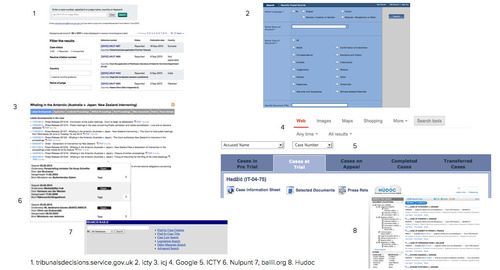
Search, filter, sort

Search examples

Search tools – see latest filings, filter by case, topic, keyword, etc – are very important.

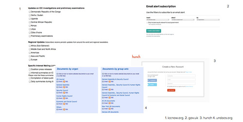
Email sign up / email alerts

Email alert examples

Open up press list to anyone to sign up. Allow users to tailor subscription to specific areas, situations, cases. Offer alerts for new filings. These tools can be used in other sections, eg ASP.

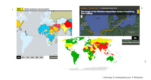
Maps

Map examples

Good to represent the scope of the court’s work and its backing (ASP), but lots of difficulties around nuance and politics.

Educational resources

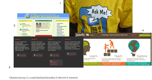
Classroom resource examples

Classroom resources and content for young people are important but difficult to do well. We need more information on audience and aims.

Feedback / transparency

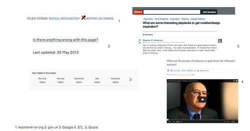
Feedback examples

Including report an error, ask a question, see an article’s history, ask for feedback. Helps to establish trust, signal openness and find out about things you might be unaware of.

Use of data / visualisations

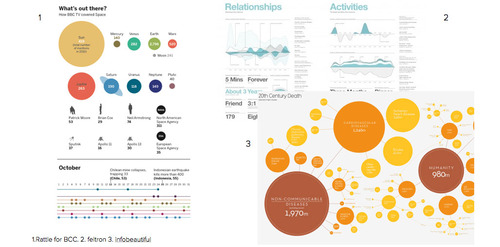
Feedback examples

To convey what the ICC has achieved judicially, politically and on the ground, eg trial chamber dealt with x decisions, x applications, x requests to give impression of complexity of the case.

Thanks! If you have any questions about this approach or the project in general, please feel free to leave a comment or contact Public Information and Documentation Section.

Sites reviewed

ICC Alpha — Initial information architecture and the shape of the ICC alpha

10 October 2013

Some of the most important needs of the ICC website users revolve around the investigative and judicial work of the ICC. It is the “irreducible core” of the ICC’s work. It accounts for over two-thirds of the visits to the site. As such it has emerged as the best way to give shape to the website.

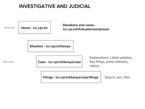
Investigative and judicial work needs to be easy to access, ordered and quick to navigate. The proposed structure reflects these needs:

The homepage will have a section showing all situations and cases http://icc-cpi.int/#situationsandcases

Each situation will then have a page, e.g., http://icc-cpi.int/kenya

Then each case within that situation will have a page, e.g., http://icc-cpi.int/kenya/case

And all the filings within the case will be available at http://icc-cpi.int/kenya/case/filings.

You can see a bit more of this structure here:

ICC Alpha IA

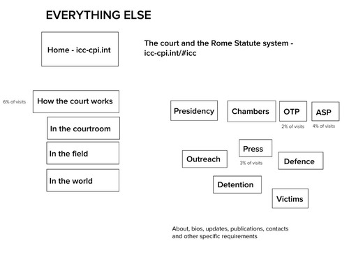
That just leaves “everything else”, which is to say that anything that does not deal with the investigative and judicial work of the ICC in the context of situations and cases will go in this other section.

A big part of “everything else” will be an explanatory section on how the court works. Rather than split this section by organ or activity we’re going to try using context as a way to convey the complex activities of the ICC. The sections will be based around:

  • In the courtroom
  • In the field
  • In the world

Each organ and section will also have its own section elsewhere, but we hope that the ICC can be explained more clearly and more compellingly by showing users how these different organs and sections work in context rather than presenting them as isolated units.

ICC Alpha IA other

The sections for each organ, section or body will be standardised. That doesn’t mean they will all look the same, but it will help the user to know where to go for the information they are looking for. We’re also going to take a lean approach to publishing in these sections. Rather than re-writing old content, we need to ask does anyone really need it? Using analytics and other data, we can make a judgement about whether to retire that content. Getting rid of this out-of-date content is good for stakeholders in the ICC (less to maintain) and good for users (less to sift through), so it is worth taking time to edit and prune.

This structure – along with search and mailing lists – will form the basis for the ICC alpha:

  1. Cases
  2. Search
  3. Situations and Homepage
  4. How the court works
  5. Organs and bodies
  6. Mailings lists & alerts
  7. Engagement

This alpha site will be a proof of concept. It won’t contain all the content and it won’t have everything needed to launch the website, but it will provide a basis for getting the things that matter most to your users right.

If you have any questions about this approach or the project in general, please feel free to leave a comment or contact Public Information and Documentation Section.

ICC Alpha — User research report

07 October 2013

Visits

The ICC website has a steady audience who visit day to day for updates on activities. There’s incredible interest during important events such as the opening of a trial (5 x normal).

ICC website pageviews graph

What do users think of the ICC current website?

The most frequent word used to describe the current ICC website was frustrating. The other words (and the answers to other survey questions) show the ICC website has a passionate and loyal audience, who are often thwarted in the tasks they must complete.

ICC website feedback word cloud

(Larger versions of these images are available in the pdf report which you can download below.)

Most common complaints:

  • “Can’t find updates”
  • “Difficult to find important decisions”
  •  Having to go to more than one place for new filings/updates
  • “Updates are too slow/Delays publishing information”
  • “Too many steps to get to a case”
  • “Search engine is not working”
  • “Overly legalistic language”
  • “Too many dead/broken links”
  •  “Streaming of trial proceedings often doesn’t work”
  •  “Cannot scroll in older IE browser”
  •  “Fonts are too small”

How easy was it to find what you were looking for?

5.3 (mean figure), 13% (very easy), 17% (very hard)

How likely would you be to recommend the website to your friends?

5.7 (mean figure), 24% (very likely), 19% (not very likely)

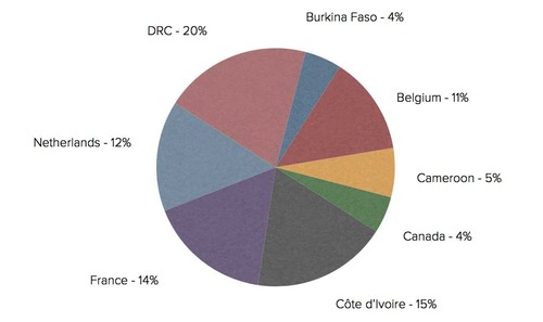
Where do users live?

Visitors from 213 different countries. Very different needs, different technologies – must try to provide a consistent experience.

Location – (One year / Analytics)
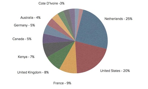
ICC website location data

These different views show how tricky it is to pin down where your users’ locations.

Location – (Sept 2013 / Analytics)
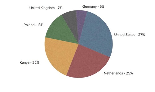
ICC website location data - one month

Visitors change if you look at the most recent month. Interest from different countries ebbs and flows according to the activities of the court.

Location – (Survey EN)
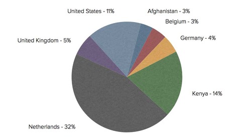
ICC website location data - survey

Location – (Survey FR)

ICC website location data - French survey

The French version of the website currently serves a small but important audience.

Who are your users?

Fairly even gender split and even divide between regular users and new visitors. Well over half the ICC website users are under 35 years old (according to the survey results). The French website accounts for less than one fifth of visits. 
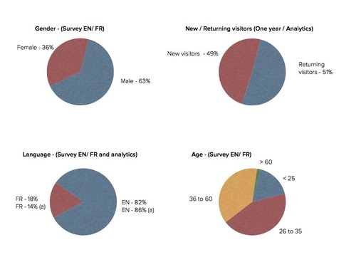
ICC website demographics

ICC website users are highly educated: nearly 70 per cent have a postgraduate degree. Lots of legal professionals, NGO professionals, journalists and diplomats, but also a lot of students and the general public, ie people who answered “other”. In case you are interested “other” included: intern, accountant, retired civil servant, clergy, private investigator, admin assistant, freelance translator, crime victim. 
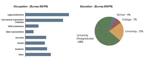
ICC website demographics - education

ICC website users spend a lot of time online. Many of its users live online, ie over five hours per day. They access it at home, at work and on the move. The browser chart (impossible to read below) shows Chrome is at the top, followed by IE (IE7 still gets used but IE6 has really dropped off), Firefox and then Safari. 
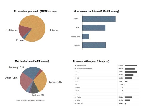
ICC website demographics - time online

Most of the traffic comes either directly or from search. Social referrals are low at the moment.
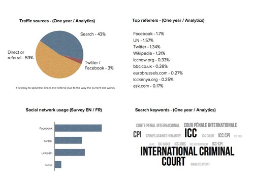
ICC website demographics - time online

“Egypt” is the top search term for the year along with “Columbia” suggesting lots of interest in where the ICC could or could not operate.
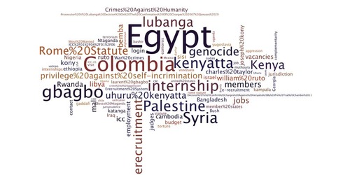
ICC website search terms

“Syria” is the top search term for September 2013 backing up the conclusions over the year (previous slide) that lots of interest in where the ICC could or could not operate. Very little content currently serves this need.
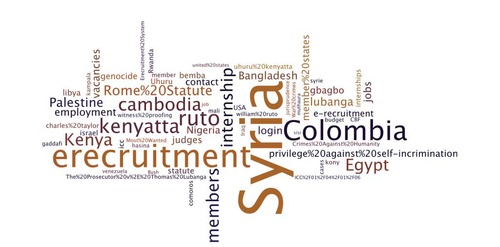
ICC website search terms - one month

Thanks for making it to the end of this report. We hope you found it useful. You can download a pdf version (2.3MB) from Scribd if you prefer. 

We will be posting information in the coming weeks on this blog about how we will use this research (which this post provides only a quick snapshot of). If you have any questions about this user research or the project in general, please contact Public Information and Documentation Section. 
ICC make mantra: justice for humanity

07 October 2013

This idea is taken from the work on the Cern website by Mark Boulton Design. Working on a project for a complicated organisation over a long period of time, this design team found it a “make mantra” useful. You can read about the details of this approach on Mark’s blog but the idea is to create a short statement or phrase which can act as a guide through the project.

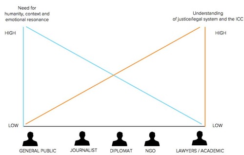
One of the trickiest parts of the ICC digital project is the diverse audiences and the difficult subject matter, so our make mantra – justice for humanity – is intended as a way to remind us about all our audiences and modulate what we say accordingly.

ICC website make mantra graph

At one side we have the general public, who have little understanding of the ICC and how it operates, but they have a need to connect with its mission on a human and emotional level. At the other side, we have lawyers and academics, who have a deep understanding of the ICC and international law. Everyone else fits somewhere on this scale.

Of course, the nuances of engaging the ICC’s different audience cannot be captured in a single phrase. For that, we have user research, personas, user needs and user stories (more about those later in this blog). Still, we hope you find this useful when considering our approach to different audiences.

↫ Newer Older ↬