ICC Alpha — Competitor review
We’ve looked at lots of other websites in the field of international justice and a few beyond to find interesting and exciting stuff. Suggestions have come from the website survey, interviews, conversations and a blog post.
Here are some of the things we’ve found. These ideas and approaches will inform the design stage of the ICC Alpha. You can download a pdf version (5.6MB) from Scribd if you prefer.
IA / Top Navigation
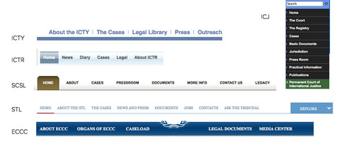
Lots of similar judicial sites follow the same IA format. Instead consider splitting the user journey more starkly with structured browse – situations/cases and the court – and having more flexible navigation. eg breadcrumb for situations/cases and a big footer. Use relatedness / relationships (tagging and metadata).
Big footers
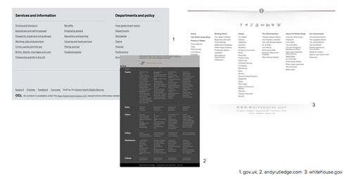
Good for reference. Informative. Useful. Almost like a sitemap at the bottom of every page.
Timelines
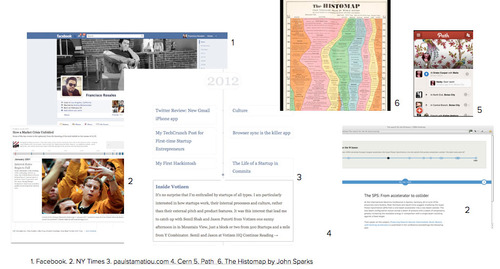
An important tool to provide clarity, context and depth for the complex cases the ICC deals with, eg telling the story of the case.
Imagery / Video
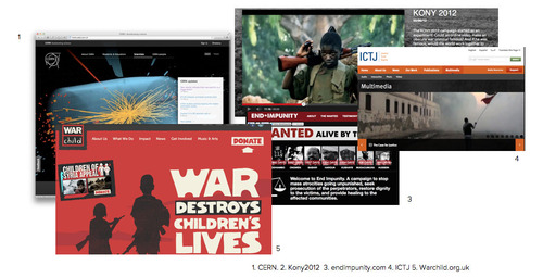
Not just walls of text. Telling a human story. Educate and inspire. Show what’s happening inside the ICC and beyond. Look further than the default option (robed judges in court).
Presenting lots of text / pdfs
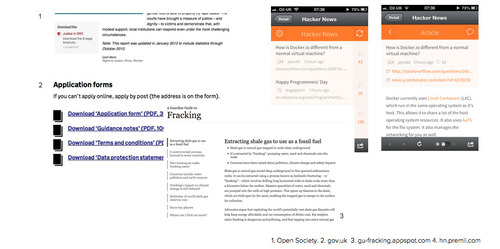
HTML needs to be the default publishing format with the exception of court filings. Effective use of typography. Plenty of white space. Readability on all devices is paramount. Clear indication of download, format, filesize before user clicks.
Search, filter, sort
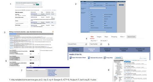
Search tools – see latest filings, filter by case, topic, keyword, etc – are very important.
Email sign up / email alerts
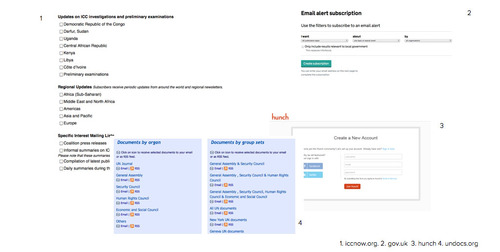
Open up press list to anyone to sign up. Allow users to tailor subscription to specific areas, situations, cases. Offer alerts for new filings. These tools can be used in other sections, eg ASP.
Maps
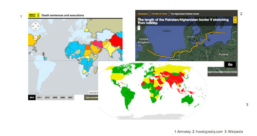
Good to represent the scope of the court’s work and its backing (ASP), but lots of difficulties around nuance and politics.
Educational resources
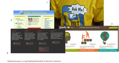
Classroom resources and content for young people are important but difficult to do well. We need more information on audience and aims.
Feedback / transparency
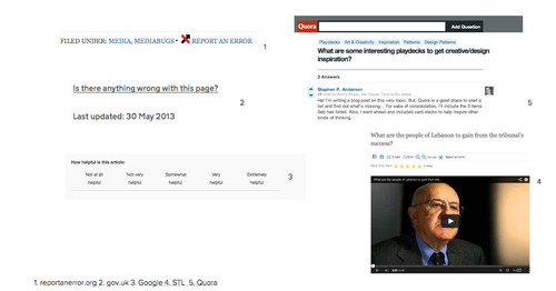
Including report an error, ask a question, see an article’s history, ask for feedback. Helps to establish trust, signal openness and find out about things you might be unaware of.
Use of data / visualisations
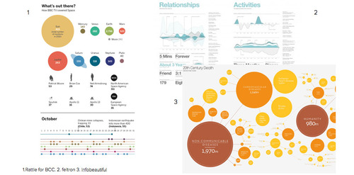
To convey what the ICC has achieved judicially, politically and on the ground, eg trial chamber dealt with x decisions, x applications, x requests to give impression of complexity of the case.
Thanks! If you have any questions about this approach or the project in general, please feel free to leave a comment or contact Public Information and Documentation Section.
Sites reviewed
- International Criminal Tribunal for the former Yugoslavia (ICTY)
- International Criminal Tribunal for Rwanda (ICTR)
- Special Court for Sierra Leone (SCSL)
- Special Tribunal for Lebanon (STL)
- Extraordinary Chambers in the Courts of Cambodia (ECCC)
- International Court of Justice (ICJ)
- European Court of Human Rights (ECHR)
- Iran-United States Claims Tribunal
- Permanent Court of Arbitration
- United Nations
- Ministry of Foreign Affairs
- United Nations News Centre
- European Union
- European Parliament
- European Commission
- Council of Europe
- Europol
- Eurojust
- OSCE: Organization for Security and Co-operation in Europe
- OAS – Organization of American States
- ICRC: International Committee of the Red Cross
- Organisation for the Prohibition of Chemical Weapons
- Nulpunt
- GOV.UK
- CERN
- World Food Programme
- Journalists for Justice
- International Organization of Migration
- White House
- Andy Rutledge
- BBC News
- Warchild
- Kony2012
- End Impunity
- Open Society Justice Initiative
- Coalition for the International Criminal Court
- Human Rights Watch
- International Center for Transitional Justice
- International Justice Project
- Amnesty International
- Fédération Internationale des Ligues des Droits de l’Homme (FIDH)
- No Peace Without Justice
- Parliamentarians for Global Action
- The Redress Trust
- Women’s Initiatives for Gender Justice
- Worldbank