Conversational UIs and bots for news and information — Part 2
Hubot is a “customisable, life-embetterment robot” created by Github. They wrote it to automate a range of activities in their company chat room. It’s open source, written in CoffeeScript on Node.js, can be deployed on Heroku and has lots of external scripts written by users. For all these reasons, we decided to use Hubot as the basis for our project.
It didn’t take long to get Hubot up and running with the Campfire. The first version responded to a few simple commands. It pulled in the latest news from the MEN’s RSS feed, sent a random old image from The Manchester Local Image Collection at the Central library and got the local weather.
We chose the Central Library as an exemplar because it was a recognisable building in the city centre and the MEN had a topic page for it.
We spent a while scraping the articles from the MEN topic page and doing various simple things such as the word count, the latest article and the oldest article. We ended up with something like this:
MEN has written 15,626 words about me in the last 7 months and a human would take about 63 minutes to read them. That’s like reading The Communist Manifesto (11,772 words) which Marx and Engels worked on at the nearby Chetham’s library in the 1840s. The latest article was 2 days ago. The oldest article was 7 months ago.
The idea was to connect the current information to interesting things in the city’s history. It didn’t quite work for a variety of reasons including the fact that Manchester apparently has an oral rather literary tradition making it trickier to find a range of books to reference. An interesting diversion nevertheless.
Moving to SMS
In sprint 2 we changed the adapter from Campfire to Twilio, so someone could interact with the system using SMS.
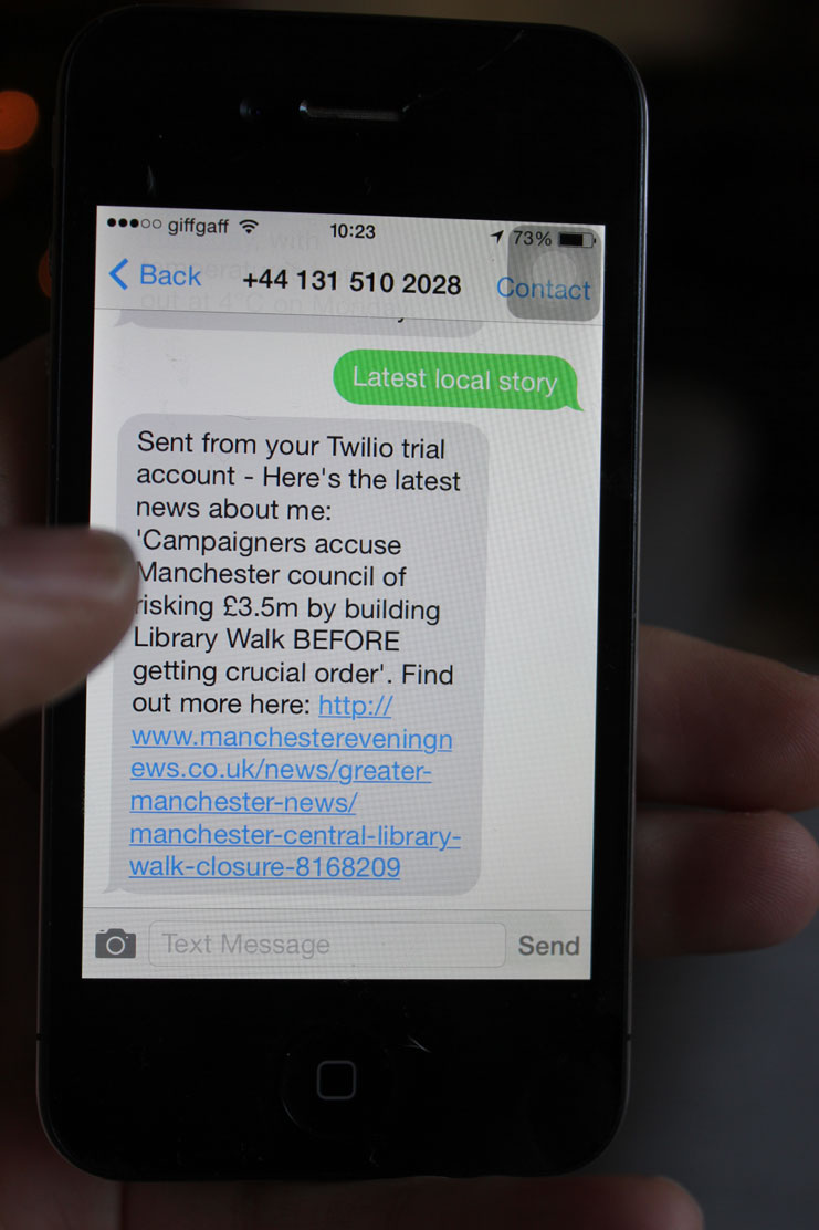
Local news worked well. The interaction felt natural and useful, providing value beyond any existing service and sitting conceptually somewhere between the web and a newspaper. It surfaces neighbourhood articles which might be lost in other mediums, e.g. web, Twitter which focus on latest.

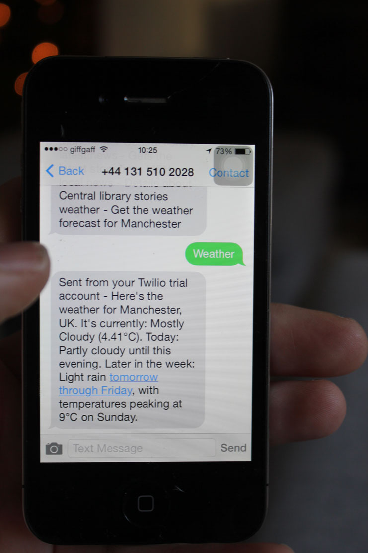
Weather was OK, but it felt a bit pointless. It needed to be more useful, unique and specific. Other apps do the weather better. We wondered if perhaps a specific question would work, e.g. is it going to rain in the next hour?

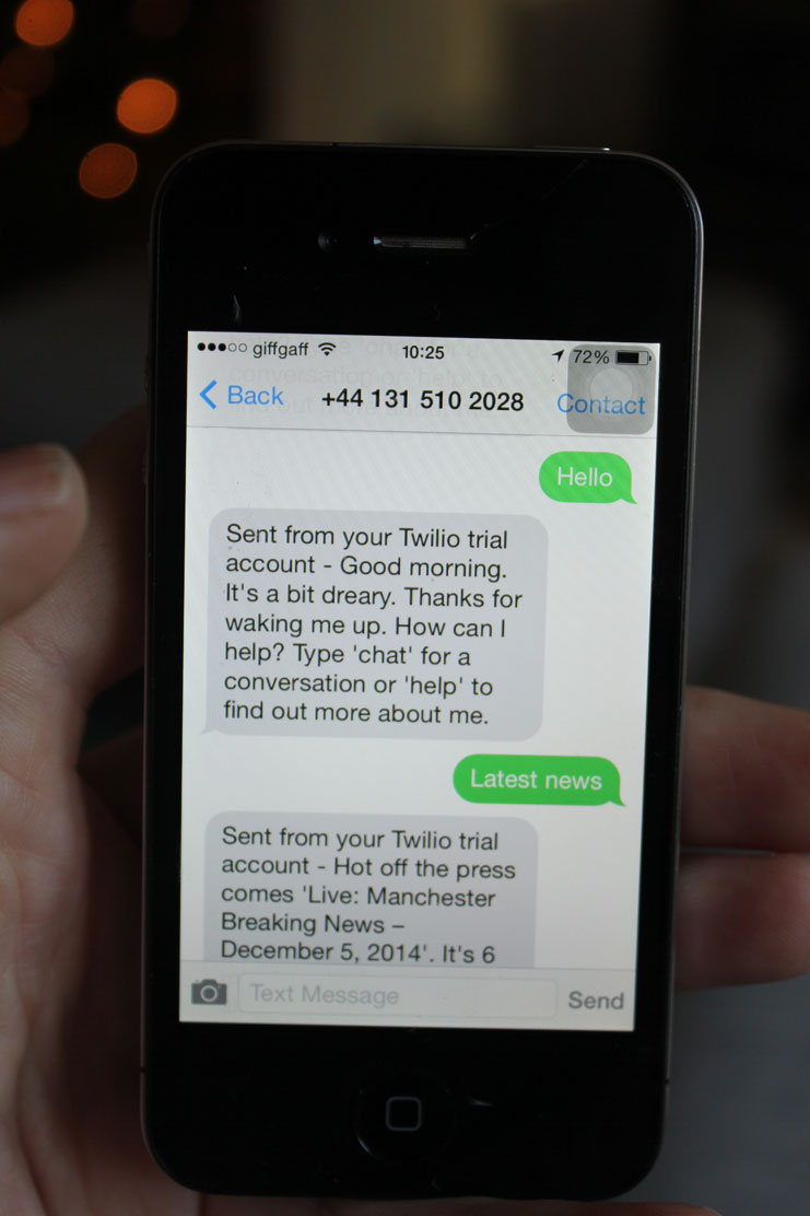
A bit of personality worked well such as knowing the time of day and the weather and responding accordingly, but having menus inside the application did not work and felt a bit confusing and wasteful.

Tentative findings
Lots of things came out of this work. It’s become quite common now, but thinking through making really is important in this type of project. We discovered practical issues such as no picture messages (Twilio MMS is US/Canada only), the potential cost to the user (could feel like “feeding a metre” for users without text-inclusive plans) and the cost to MEN (at $0.04 to send and $0.0075 to receive an SMS is the interact valuable enough?). We also got used to some of the affordances and qualities of SMS as a material. People don’t usually sit and wait for a reply with a text message. They text and receive texts on the move meaning the initial premise of standing in front of an object could be going against the grain. We also discovered that general information, such as the Central library guided tour, is not useful or compelling enough to work in this context.
Material affordances
A quick chat with Tom Armitage, who worked on Hello Lamppost, helped to clarify some of the important conclusions to be drawn here.
- SMS tends to be an intimate space usually reserved for messages from friends. Though companies and services are encroaching, it is still a private space with particular opportunities and issues.
- There’s no room for extended, light conversations because it is too expensive and maintaining attention could quickly become a problem. Each message must be useful, dense and meaty.
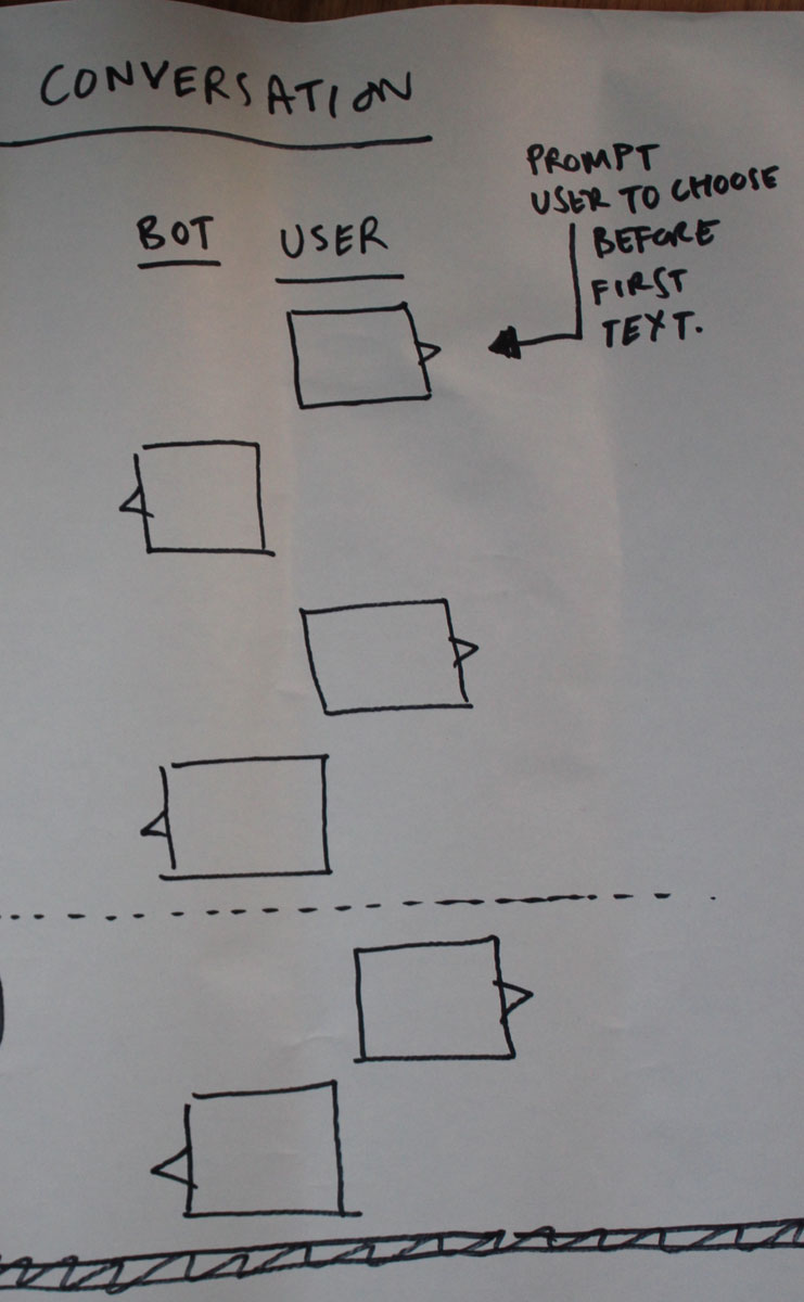
- No room for menus or instructions inside the application. We have to make the first text count by making the user choose options in initial text and move the prompts with instructions outside the application.
The conversation is probably going to follow a shape like this:

This shape also led us to explore what to do with the secondary interaction. Could we gather information from user? Could the user customise the service by responding to the first SMS with those preferences remembered so that the service improves over time, a bit like — as Tom pointed out — the homotropic newspaper-vending robot in Philip K Dick’s novel The Game-Players of Titan?
In the end, the focus came down to being useful. Sprint 3 would focus on user needs with a playful personality. The system could become a convenient way to access the many APIs and data about the city. We would explore the usual suspects such as neighbourhood news, weather, travel delays and departures and open data such as neighbourhood statistics and census information as well as whether it was a good way to gather information from users.
We also decided to move from SMS to Twitter to avoid the question of cost to the user and the MEN.
This post is part of a series about a project exploring conversational UIs for news and information to help Manchester Evening News become part of the fabric of the city.